
The solution
Sourced from the source
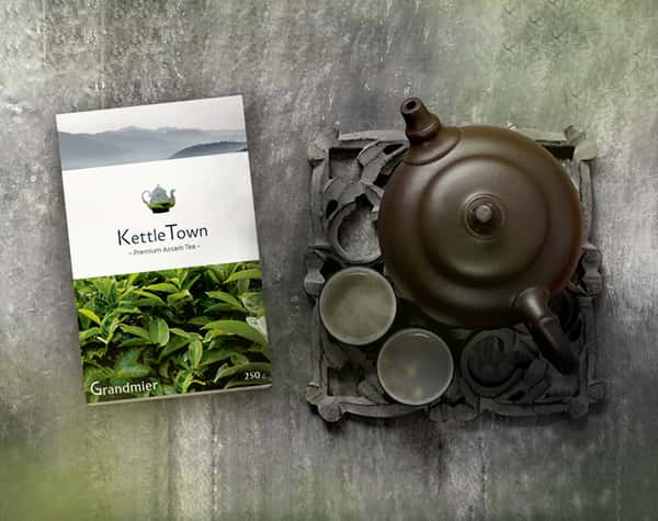
A package that resonated with the untainted origin of the product, through a modern design. A design that was evocative of the purity of its ingredients, with a logo that saliently represented the brand vision – bringing tastes from the legendary tea valleys of Assam, into a kettle.

The product
A contemporary depiction
A minimalistic design with an image of the mountainous highlands, blanketed by tea plantations, and a shroud of ethereal mist, that essentially brought out its pristine descent. This vibrant image, contrasted by a bold, white strip lent an appealing balance to the design, while the use of elegant, slender fonts added poise. The logo comprised of a kettle strategically enclosing a part of the background landscape, aptly representing ‘KettleTown’.


My contribution
Translating the vision into a visual
Illustrated layout versions through sketches, and developed the one that most strikingly befitted the brand. Designed the package with a contemporary look-and-feel, harmonised by the use of white space and a soothing colour scheme, thus creating a label that was distinctively identifiable as fresh and natural, at first glance.