The Community Centre Portal
This work includes User Research, Design Thinking Workshops, Distillation from User Discovery, Wireframing, Information Design, UI Design, Prototyping for the FedDev Ontario Community Centre portal on the internal web platform. The challenge was to create a visually and dynamically interactive portal that would serve as a hub for social engagement and informal Agency-wide events.
Target Users: All employees of FedDev Ontario (230-250, 18+ years)
Discovery
The discovery of user needs was an essential step in design and development. Discovery sessions were conducted with potential users through collaborative design thinking workshops. The workshop consisted of the following three activities:
Purpose Statement
This activity involved brainstorming words in sprints of 45-60 seconds to fill in each of the five blanks in the statement “Our product is for _____ who need _____. It is a _____ that provides _____ unlike _____. “

- The activity was helpful in extracting what the product essentially needs to communicate.
- The activity allowed the team to synthesise different ideas into one concise statement.
- It answered key questions posed by the stakeholders.
Brainwriting
The Brainwriting activity involved penning down all the possible attributes or qualities for a particular aspect of the project, in this case, the features of the portal and the information required from its users.

- It was helpful in collecting quick thoughts and mitigated self-censorship.
- It was a useful in collecting different ideas related to one aspect of the project, and could be applied to any area of project design that required this kind of focused intervention.
Priority Mapping
This activity included arranging the post-its from the Brainwriting activity in order of priority and feasibility over a graph. The ones with the highest value needed to be placed closer the origin, and subsequent moving away as the value reduced.

- This helped determine features that are most crucial to the product, and helped to define the project’s scope.
- The information was synthesised as below:
- Quad 1: Most important, high feasibility (Alpha)
- Quad 2: Important, low feasibility, higher effort (Beta)
- Quad 3: Low importance, high feasibility (Beta)
- Quad 4: Gold plating, good-to-haves (Gold)
This design thinking workshop was so well-received that it is now being adapted agency-wide as a part of user discovery with other clients. I have made the design thinking template available here.
Wireframe
The discovery phase helped answer pressing questions which led to the design of the wireframe. Eight key features were identified to go into the MVP: The Calendar, Events, The CookBook, The Pipeline, Social Teams Channels, Volunteering, National Public Service Week (NPSW), and Government of Canada Workplace Charitable Campaign (GCWCC). Categories were identified to group and arrange these features to streamline the user’s experience: What’s upcoming, What’s new, Where to participate, and What else is happening!


UI Design
The UI design necessitated a vibrant, non-corporate and dynamic appeal that would instantly engage users.
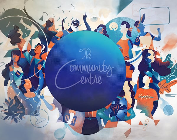
The banner was to represent a diverse community of people. An illustrative depiction of people diverse in age, ethnicity and gender was selected. The banner was proposed to be dynamic using a hover interactivity or a loop-able gif of the illustration and was designed to be responsive.
The events list, a crucial feature of the portal, was placed prominently below the calendar as a carousel interaction. A vertical carousel was added for set of recipes that would be dynamically selected from The CookBook. The social Teams Channels were populated in vertical carousel, with the option of joining any of the enlisted social channels. Finally, an option was provided to get in touch with the Comms teams via email with the click of a button at the bottom of the portal.


Visual Design
Hero Image